Investigating Weather and Climate with Google Earth.
Students will use Google Earth to explore global temperature changes. They will use Google Earth to determine how the temperature of the Earth has changed during a recent 50 - 58 year period. They will also explore, analyze, and interpret climate patterns of 13 different cities, and analyze differences between weather and climate patterns.
1. Inform students that they will use Google Earth to explore global temperature changes around the world.
2. Distribute the Investigating Weather and Climate with Google Earth Student Guide to each student.
3. Use an LCD projector to display Google Earth at the front of the room.
4. Ask students to launch Google Earth on their computers.
5. If needed, provide a brief orientation of Google Earth layout and navigational tool set.
6. Instruct students to download the Weather and Climate.kmz file and view the file in Google Earth.
7. Instruct the students to turn on the Google Earth Gridlines if they are not activated.
8. Show students how to navigate from one city location to the next.
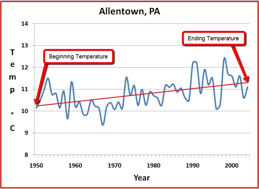
9. Display the Allentown climate graph in the 3D viewer. Show students how to read and interpret this climate graph. Note that “years” are located on the x-axis and “temperature in degrees Celsius” is located on the y-axis. All climate graphs display a time period between 50 and 58 years. The temperature data is displayed as the average annual temperature for each year. The red line that passes through the graph is a linear trend line. The linear trend line shows how the climate has changed in the last 58 years. Note positive slope of the linear trend line in the Allentown graph. A positive slope indicates that average annual temperature has been increasing over a 58-year period. Note that the temperature difference between the start and end of the linear trend line is about one degree. Therefore, this graph data should be interpreted that the average annual Allentown climate has increased approximately one degree Celsius over a 58-year period.
Important Note:
We recommend that you show students how to make a climate graph appear larger in Google Earth. To do this, control-click on the graph (or right mouse click for PC users). Next, select “Open Image”. When finished, click “Back to Google Earth” to return to the Google Earth viewer display.
Note:
The easiest way to determine the change in temperature is to follow the linear trend line as shown above. Students should observe and record the temperature at the beginning of the trendline as shown in the picture above. The students should then observe and record the end temperature as shown above. The "Beginning" temperature can be subtracted from the "End" temperature to determine the change across the 50-58 year time period.
10. Distribute the Investigating Weather and Climate with Google Earth Student Investigation Sheet to each student. Tell students that they will complete the data table by analyzing climate graphs from 13 different global cities. For each city, they will record the minimum and maximum average annual temperature (in degrees Celsius) and determine the 50 – 58 year climate pattern.
11. Have students view the Allentown climate graph in Google Earth to identify the minimum and maximum temperature. Remind the students that temperature is in degrees Celsius. Inform students that a magnitude of 1 °C is equal to a magnitude of 1.8 °F.
Implementation Suggestion:
You may wish to walk students through a second example to highlight a linear trend line that has a very small positive slope to compare with the linear trend line in the Allentown graph. Display the Akureyri climate graph. Akureyri is the second city listed in the Places window. Note that the linear trend line of Akureyri does not increase as much as the Allentown graph. It is less than 0.5 °C. You may also point out to students that Akureyri has two different periods of 5 years that have weather cooling trends in which the average annual temperature does not exceed the linear trend line.
12. Instruct students to analyze the climate graphs from the other cities and complete the data table. Remind students to be sure to examine the linear trend line in each city and to place an “X” in the appropriate column under Magnitude of Temperature Warming over the last 50 - 58 Years (1950 – 2008) on the data table.
Implementation Suggestion:
Some low-ability students may require additional support for completing this learning task. You may wish to walk through each city one at a time as an entire class using guided questions to analyze each city’s climate graph. This instructional strategy is effective using one computer in the classroom that displays the image to the front of the room.
13. Instruct students to answer the analysis questions on their investigation sheet.
Note:
If your students are not familiar with geographical latitude coordinates, explain that N (north) and S (south) in latitude are geographical positions referenced to the equator. The equator has 0˚ latitude. Larger latitude values (both positive and negative) are further away from the equator.
14. Review and discuss student responses to key questions.
Implementation Suggestion:
Some low-ability students may require additional support with answering analysis questions 7 and 8. To assist students with question 7, you may wish to display the climate graph of Las Vegas to highlight that the weather in Las Vegas in a 10-year period fluctuates with many average annual temperature readings that are higher and lower than the 50-year climate pattern. To assist students with question 8, you may wish to display the graph of Moscow to highlight that the average annual temperatures in Moscow have greater fluctuations (or variability) over a 10-year period compared to the average annual temperatures in Las Vegas.
15. To conclude the class session, show the video clip: How do we know the earth is warming?
Note:
The video clip is a large file. You may wish to download the video clip to your computer prior to using it in your classroom.
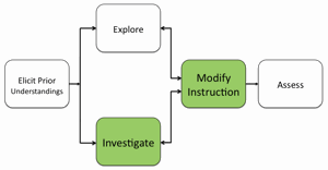
16. If students at the completion of the activity do not understand that changes in climate are variable based on location and that the magnitude of observable climate change temperature is quite small, modify instruction as needed to ensure learner understandings.
Materials Needed:
Handouts
(1) Investigating Weather and Climate with Google Earth Teacher Guide (PDF / MS Word)
(2) Investigating Weather and Climate with Google Earth Student Guide (PDF / MS Word)
(3) Weather and Climate Student Investigation Sheet (PDF / MS Word)
KML File
PowerPoint File
Video
How do we know the earth is warming? (24 MB) Duration 1:31
Assessment Information
Weather and Climate Student Investigation Sheet Assessment (PDF / MS Word)
Supplemental Homework Readings for Students
What is the Relationship Between Climate Change and Weather (PDF)
Teacher Resources/Content Support
Weather and Climate - Print Version (PDF)
Earth System - Print Version (PDF)